
HSE’s guidance is rather blunt on one specific point around safety. A fire safety sign bearing text and text alone, such as “Fire Exit”, is not accepted. If no stock sign fits the hazard, employers can customise here within the same rules rather than generate their own on a whim.
What the regulations fix & what they don’t
The Health and Safety (Safety Signs and Signals) Regulations 1996 see signs as very much the last layer. Regulation 4 is what requires them, and it’s where a risk remains despite other measures being taken. So, a sign is never the control itself.
HSE’s own example in its L64 guidance is a workplace where there may still be “a risk of foot injury despite taking measures to control the risk” – a sign reminding staff that foot protection is mandatory is therefore needed because the risk hasn’t been eradicated or entirely controlled.
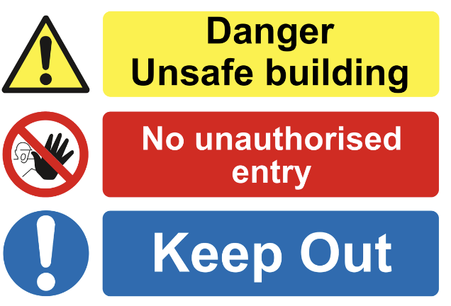
Schedule 1 is what fixes the visual grammar. A red-edged circle. A yellow triangle. A blue circle. A green rectangle. Each with its own pictogram colours.
- Prohibition signs are round (black pictogram on white and red edging; a diagonal line)
- Warning signs are yellow triangles (black edging)
- Mandatory signs are blue circles (white pictogram)
- Escape and first-aid signs are green rectangles or squares
Bear in mind that pictograms “must be as simple as possible and should contain only essential details” – a custom order doesn’t get to renegotiate any of it, and that’s why you want a reputable supplier.
The pictogram itself has a bit more room, though, as Schedule 1 lets it differ slightly from the drawings (or carry more detail) provided it conveys the same meaning. L64 goes further. Paragraph 41 says the pictograms in BS EN ISO 7010 can actually be used to comply, and paragraph 42 says that where Schedule 1 has no suitable sign, an employer may design their own (albeit following the Regulations’ general principles). Surprising, given how prescriptive the colour rules are.
When a custom sign earns its place
Consider the gap between a stock sign and one particular site. L64 says that it “may sometimes be useful to supplement a safety sign with text to aid understanding”. Particularly when a sign is new or unfamiliar, the text has to match the sign’s category, so a mandatory sign uses “must” rather than “should” or “may”. A lot of the softer wording people like to add just doesn’t survive.
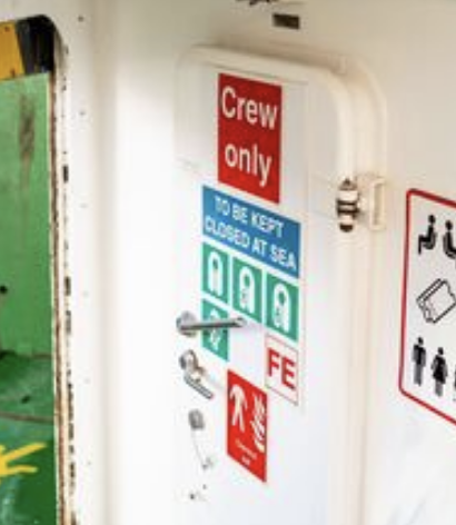
Doors are the obvious case. Where an exit could become obstructed, L64 says a “Fire Escape – Keep Clear” sign should go on the appropriate faces of the door. There’s no room for different expressions. Stores are another. The general danger sign mustn’t be used to warn about hazardous substances, except to mark a store holding a number of them. For a mixed store, for example, the general danger triangle is allowed, and a custom panel can name what’s actually kept there. Some freedom; not loads.
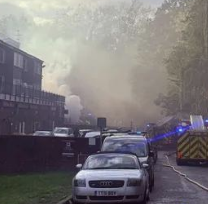
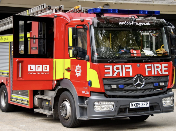
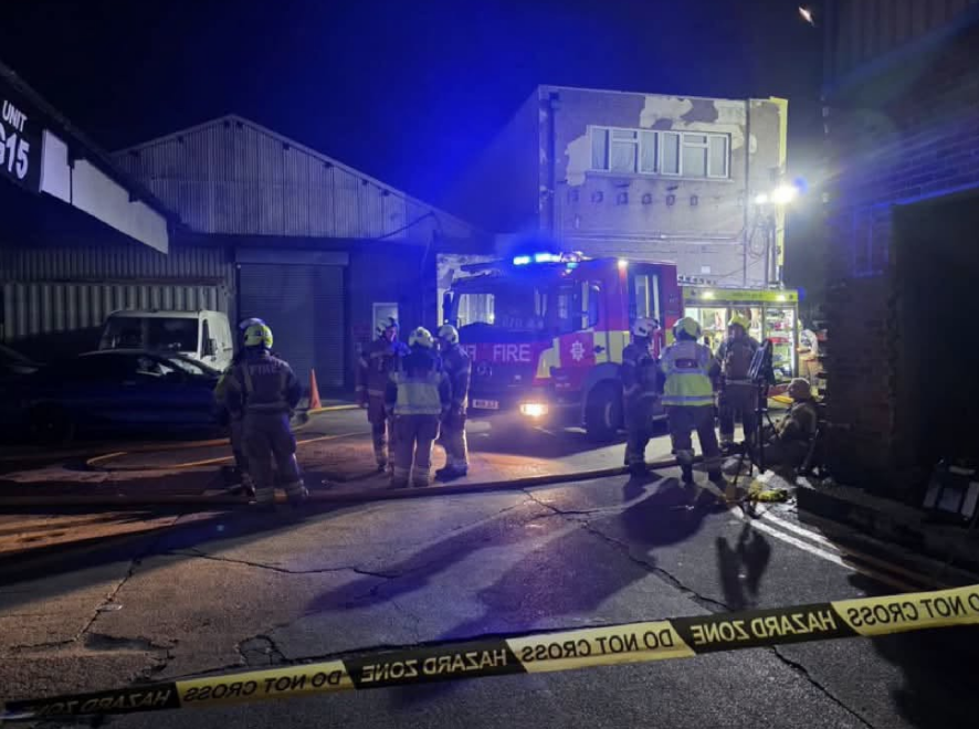
The site itself decides the rest. Schedule 1 wants signboards in impact- and weather-resistant material suited to their surroundings, and where natural light is poor, “phosphorescent colours, reflective materials or artificial lighting should be used”. That last one in particular is what matters when things go wrong. A fire at a commercial premises on Lowfield Street in Dartford in 2024 (an electrical fault was the suspected cause) needed four Kent Fire and Rescue engines – thankfully nobody was hurt. Escape signs in a building like that have to be readable when the lights fail (as they likely will during an electrical fault), which makes material so important to the order.
What to check before ordering
Start with size. L64 paragraph 37 says size “should be appropriate for intended viewing distance” and points to BS 5499-4:2013 and BS 5499-10:2014 for the detail. A sign meant to be read from, say, the far end of a loading bay needs working out against those.
Arrows next. “This way” arrows for emergency equipment, of course, shouldn’t contradict the direction of escape, so where confusion could misdirect people evacuating, L64 says to consider whether those signs should be used at all. Sometimes, less is more.
Then there’s the people reading them. Regulation 5(2) requires “suitable and sufficient instruction and training in the meaning of safety signs”, and L64 notes that new, young or inexperienced employees may not understand the less common ones. Then there’s the fact that a custom sign is by definition one that nobody has seen before, so its meaning ought to be explained to staff before it goes up.
Contractors aren’t exempt either: L64 says they should check their own employees know the signs they’re likely to meet. Though, visitors are a looser case here, and it’s more on you than regulation to consider them (whether they’ll recognise or understand the signs).
Seton is an example of having a custom range that covers hazard, mandatory, prohibition, multi-message, and so on, built from a template with online design tools. Ultimately, you need to know what you can and can’t customise, and that’s where a reputable supplier can help.